Decorating Your Home with the Power of Complementary Colors
Color is more than visual appeal—it’s a fundamental tool in interior design. Among the many strategies for using color effectively, one of the most powerful is working with complementary colors. When applied thoughtfully, these pairings can energize a space, define mood, and enhance architectural elements. Whether you're updating a single room or outfitting a new build, understanding how to use complementary colors can elevate your home decor from ordinary to striking.
What Are Complementary Colors?
Complementary hues are positioned across from one another on the color wheel. Some examples are red paired with green, blue with orange, and yellow with purple. When paired together, these colors create a strong contrast that draws the eye and creates dynamic visual interest. This contrast makes each color appear more vivid, adding depth and personality to any space.
For home and building professionals, this knowledge is more than theory—it’s a practical tool for balancing tones, guiding focal points, and bringing cohesion to a palette.
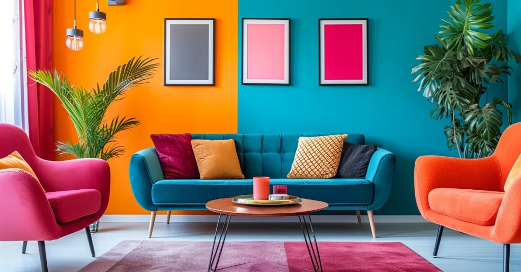
Applying Complementary Colors in Home Decor
1. Living Spaces
Use complementary colors to bring life to common areas like living rooms and dining rooms. For example, a soft blue wall can be offset by burnt orange accents in cushions, rugs, or artwork. The key is moderation: use one color as the dominant hue and its complement as an accent. This creates harmony without overwhelming the space.
2. Kitchens and Bathrooms
In kitchens, pair green cabinetry with subtle red or pink tones in tile backsplashes or countertop decor. In bathrooms, purple-gray walls matched with golden-yellow fixtures or linens can add warmth and contrast. Durable materials in bold finishes—such as ceramic tiles or powder-coated metals—make it easy to apply this color theory while maintaining functionality.
3. Bedrooms and Personal Spaces
Complementary colors can also enhance intimacy and tranquility. A deep navy paired with rust-orange can feel both bold and cozy. Incorporate these combinations through bedding, headboards, or accent furniture.
Working with Building Materials and Finishes
Professionals in the building industry often have access to a broad palette of finishes—from flooring and paint to stone and laminate. Choosing complementary colors at the material selection phase ensures a cohesive visual flow throughout the property.
For example, pairing a cool slate floor with warm-toned wood cabinetry balances temperature and tone. Similarly, selecting countertops and cabinetry in opposing color families can subtly reflect complementary contrast.
Manufacturers now offer pre-coordinated color packages, making it easier than ever to apply this principle without extensive trial and error. For builders and designers, this streamlines the design process while ensuring aesthetic impact.
Tips for Successful Implementation
Use the 60-30-10 Rule: Use one color for 60% of the room (walls, large furniture), the complementary color for 30% (secondary furniture, drapes), and an accent tone for the remaining 10% (art, decor, accessories).
Play with Saturation: Not all complementary schemes have to be high-contrast. Muted or pastel versions of complementary pairs can offer a softer, more sophisticated look.
Sample Before You Commit: Always test paint swatches and material samples under various lighting conditions. Natural and artificial lighting can alter the way colors appear and interact.
Achieve harmony with neutral tones: incorporate shades such as white, gray, or beige to connect complementary colors and avoid visual conflict.
Why It Matters
For home decor professionals and builders alike, using complementary colors is a cost-effective way to make a space feel designed and intentional. It communicates polish and attention to detail, enhancing perceived value without requiring high-end materials or complex architectural interventions.
Incorporating complementary color theory doesn’t require a degree in design. With a little planning and some knowledge of the color wheel, any space can benefit from this technique. For those in the home and building sectors, mastering this skill offers clients more than just beautiful results—it offers results that sell.
Conclusion
Complementary colors have long been a cornerstone of smart design. By applying them effectively across different rooms and materials, home decor professionals and builders can deliver vibrant, engaging interiors that resonate with clients and homeowners alike. Whether through bold contrasts or subtle pairings, the right color choices can transform a house into a home—one with character, balance, and undeniable visual appeal.
More info visit: https://www.gstarboard.com