Introduction
Publishing a book is no small feat. After countless hours of writing, editing, and revising, the last thing you want is for formatting errors to detract from your masterpiece. Proper formatting ensures your book looks professional and is enjoyable to read. In this article, we’ll dive into the top book formatting mistakes to avoid in your next publication, with tips on how book formatting services can help you achieve a polished final product.
Book Formatting Services: Why You Need Them
Professional book formatting services are crucial for transforming your manuscript into a book that meets industry standards. From adjusting margins to selecting the right font, these services ensure that your book looks great both in print and digital formats.
1. Inconsistent Fonts
One of the most glaring mistakes in book formatting is the use of inconsistent fonts. Switching between different fonts can confuse readers and disrupt the flow of your text.
How to Avoid It
- Stick to one or two fonts throughout your book.
- Use a standard font like Times New Roman or Arial for the main text.
- Apply a different font only for headings and subheadings if necessary.
2. Incorrect Margins
Margins play a significant role in the readability of your book. Incorrect margins can make your text look cramped or unevenly spaced.
How to Avoid It
- Set your margins according to standard publishing guidelines.
- For print books, ensure enough space for binding.
3. Poor Line Spacing
Line spacing affects the readability of your book. Too much or too little space can make reading difficult.
How to Avoid It
- Use 1.15 or 1.5 line spacing for body text.
- Ensure consistent line spacing throughout the document.
4. Inconsistent Heading Styles
Using inconsistent heading styles can make your book look unorganized and unprofessional.
How to Avoid It
- Define your heading styles at the beginning of the formatting process.
- Apply the same styles consistently throughout your manuscript.
5. Inadequate Page Breaks
Failing to use page breaks appropriately can lead to awkward text placement and disrupt the flow of your book.
How to Avoid It
- Insert page breaks at the end of chapters or sections.
- Avoid using multiple line breaks to create space.
6. Ignoring Hyphenation Rules
Incorrect hyphenation can affect the appearance and readability of your text.
How to Avoid It
- Enable automatic hyphenation in your word processor.
- Review hyphenated words to ensure they don’t disrupt readability.
7. Misaligned Text and Images
Text and images that aren’t properly aligned can make your book look amateurish.
How to Avoid It
- Use alignment tools in your word processor.
- Ensure images are aligned with the text they accompany.
8. Improper Table Formatting
Tables can be tricky to format correctly. Improperly formatted tables can be difficult to read and understand.
How to Avoid It
- Use simple and clean table designs.
- Ensure all columns and rows are properly aligned.
9. Neglecting Widows and Orphans
Widows and orphans are single lines of text at the beginning or end of a page, which can disrupt the reader’s flow.
How to Avoid It
- Use widow and orphan control settings in your word processor.
- Manually adjust paragraphs to prevent widows and orphans.
10. Forgetting Page Numbers
Missing page numbers can confuse readers, especially in a print book.
How to Avoid It
- Add page numbers to every page except the title page.
- Ensure page numbers are placed consistently (top or bottom of the page).
11. Ignoring Paragraph Indentation
Proper paragraph indentation improves readability and guides the reader through your text.
How to Avoid It
- Indent the first line of each paragraph by 0.5 inches.
- Avoid using multiple spaces or tabs for indentation.
12. Incorrectly Formatted Block Quotes
Block quotes should stand out from the main text but still look cohesive.
How to Avoid It
- Use indentation and a smaller font size for block quotes.
- Ensure block quotes are consistently formatted.
13. Overuse of Bold and Italics
While bold and italics can emphasize text, overusing them can make your book look cluttered.
How to Avoid It
- Use bold and italics sparingly for emphasis.
- Reserve these styles for headings, subheadings, and key points.
14. Neglecting Chapter Titles
Chapter titles should be clearly distinguished from the main text.
How to Avoid It
- Use a larger font size or different style for chapter titles.
- Ensure chapter titles are consistently formatted throughout the book.
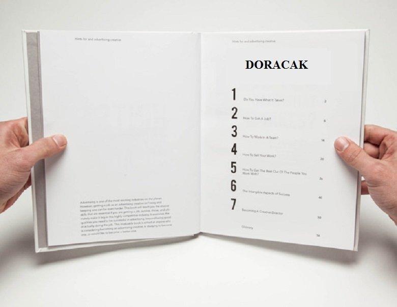
15. Skipping the Table of Contents
A table of contents is essential for navigating longer books, especially non-fiction.
How to Avoid It
- Automatically generate a table of contents using your word processor.
- Ensure all chapters and sections are included in the table of contents.
16. Incorrectly Formatted Footnotes and Endnotes
Footnotes and endnotes should be easy to read and consistent.
How to Avoid It
- Use a smaller font size for footnotes and endnotes.
- Ensure numbering is consistent and continuous.
17. Poorly Designed Cover Page
The cover page is the first thing readers see, so it should be well-designed and inviting.
How to Avoid It
- Use professional design software or hire a designer.
- Ensure the cover includes the title, author’s name, and relevant imagery.
18. Ignoring Print vs. Digital Formatting
Print and digital formats have different requirements. Ignoring these can lead to a poor reading experience.
How to Avoid It
- Format your book separately for print and digital versions.
- Ensure images and text are optimized for both formats.
19. Inconsistent Spacing Between Sections
Inconsistent spacing can make your book look disorganized.
How to Avoid It
- Use consistent spacing before and after headings.
- Maintain uniform spacing between paragraphs and sections.
20. Failing to Proofread the Final Format
Even after all formatting is done, proofreading the final format is crucial.
How to Avoid It
- Review the formatted manuscript for any errors.
- Consider hiring a professional proofreader.
Book Marketing Services: Promoting Your Well-Formatted Book
After you've perfected your book's formatting, the next step is getting it in front of readers. Book marketing services can help you create a buzz around your book, ensuring it reaches its target audience. From social media campaigns to email marketing, these services can significantly boost your book's visibility and sales.
Conclusion
Proper book formatting is essential to creating a professional and readable book. By avoiding these common mistakes and utilizing professional book formatting services, you can ensure your book is a pleasure to read from start to finish. Remember, a well-formatted book not only looks good but also enhances the reader's experience.
FAQs
1. What are book formatting services?
Book formatting services are professional services that ensure your manuscript meets industry standards for both print and digital formats. They take care of margins, fonts, spacing, and other formatting aspects.
2. Why is book formatting important?
Proper book formatting enhances readability and ensures a professional appearance, making your book more appealing to readers and publishers.
3. Can I format my book myself?
Yes, you can format your book yourself using word processors and formatting guides. However, hiring professional book formatting services can save time and ensure a polished final product.
4. What is the difference between print and digital book formatting?
Print formatting focuses on aspects like margins, page numbers, and paper size, while digital formatting ensures readability on various devices and platforms, optimizing for screen size and resolution.
5. How much do book formatting services cost?
The cost of book formatting services varies depending on the length of the manuscript, the complexity of the formatting, and the service provider. Prices can range from $100 to several hundred dollars.
6. What are some common book formatting mistakes?
Common mistakes include inconsistent fonts, incorrect margins, poor line spacing, and failing to proofread the final format. Avoiding these errors ensures a professional-looking book